The Portrait Pastel with Shirley Chi
We caught up with artist Shirley Chi to learn more about her creative practice and her approach to working with pastel.
A former competitor on Sky Arts’ Portrait Artist of the Year and a regular exhibitor at the Green & Stone Summer Exhibition, Shirley is known for her thoughtful and expressive approach to realist portraiture. Through her work, she explores the relationship between colour, light, texture and the unique character of each sitter.
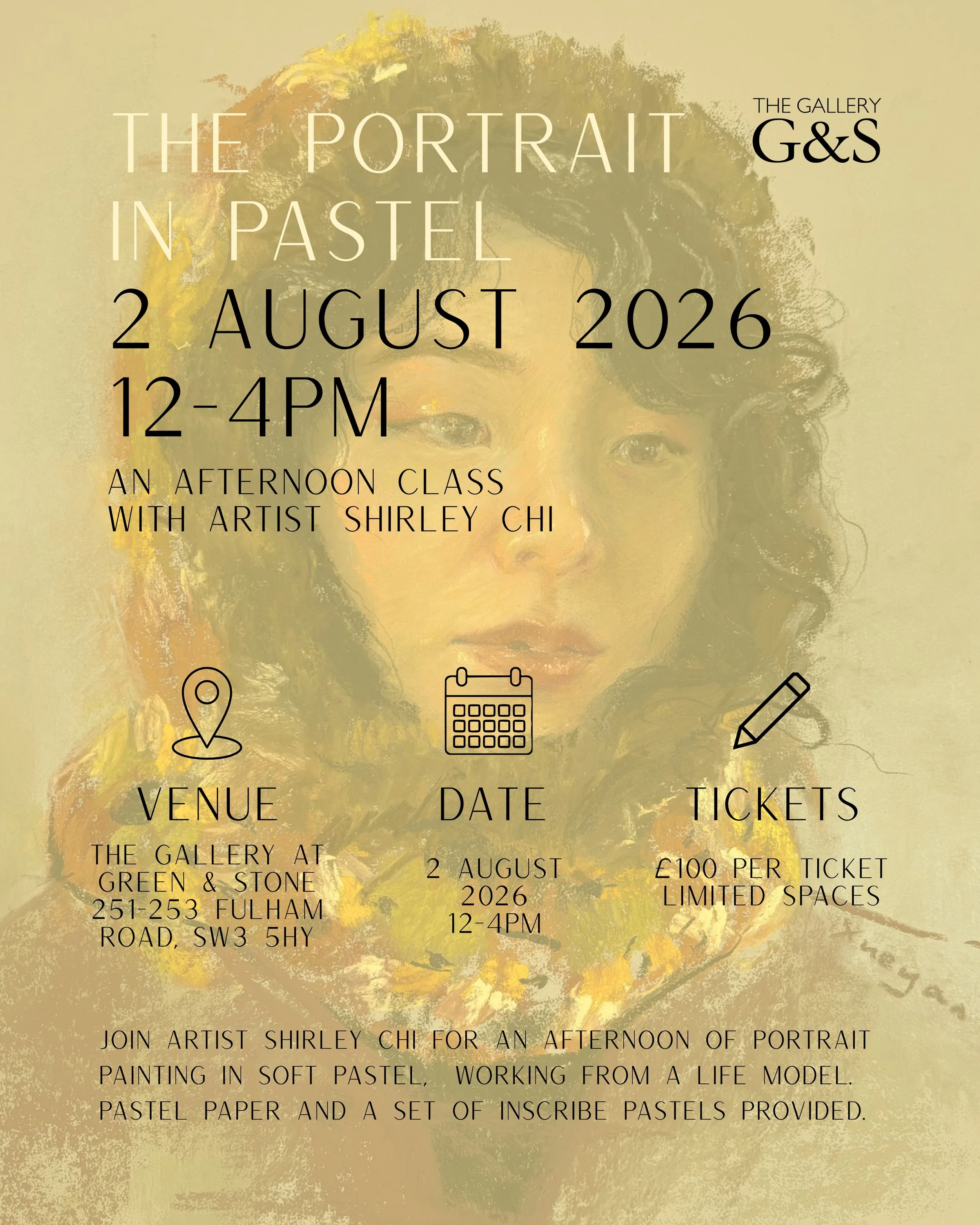
On August 2nd, Shirley will be joining us at Green & Stone to lead ‘The Portrait in Pastel’, a one-day workshop exploring the foundations of realist pastel portraiture. From choosing materials and preparing a surface to building form through colour, value and expressive mark-making, participants will learn Shirley’s approach to creating a convincing and engaging portrait.
The workshop is open to all levels and will include demonstrations, individual guidance and the opportunity to work from a live model while developing a finished portrait. Each participant will also receive a complimentary set of 24 full-stick Inscribe pastels to use during the class and continue exploring the medium afterwards.
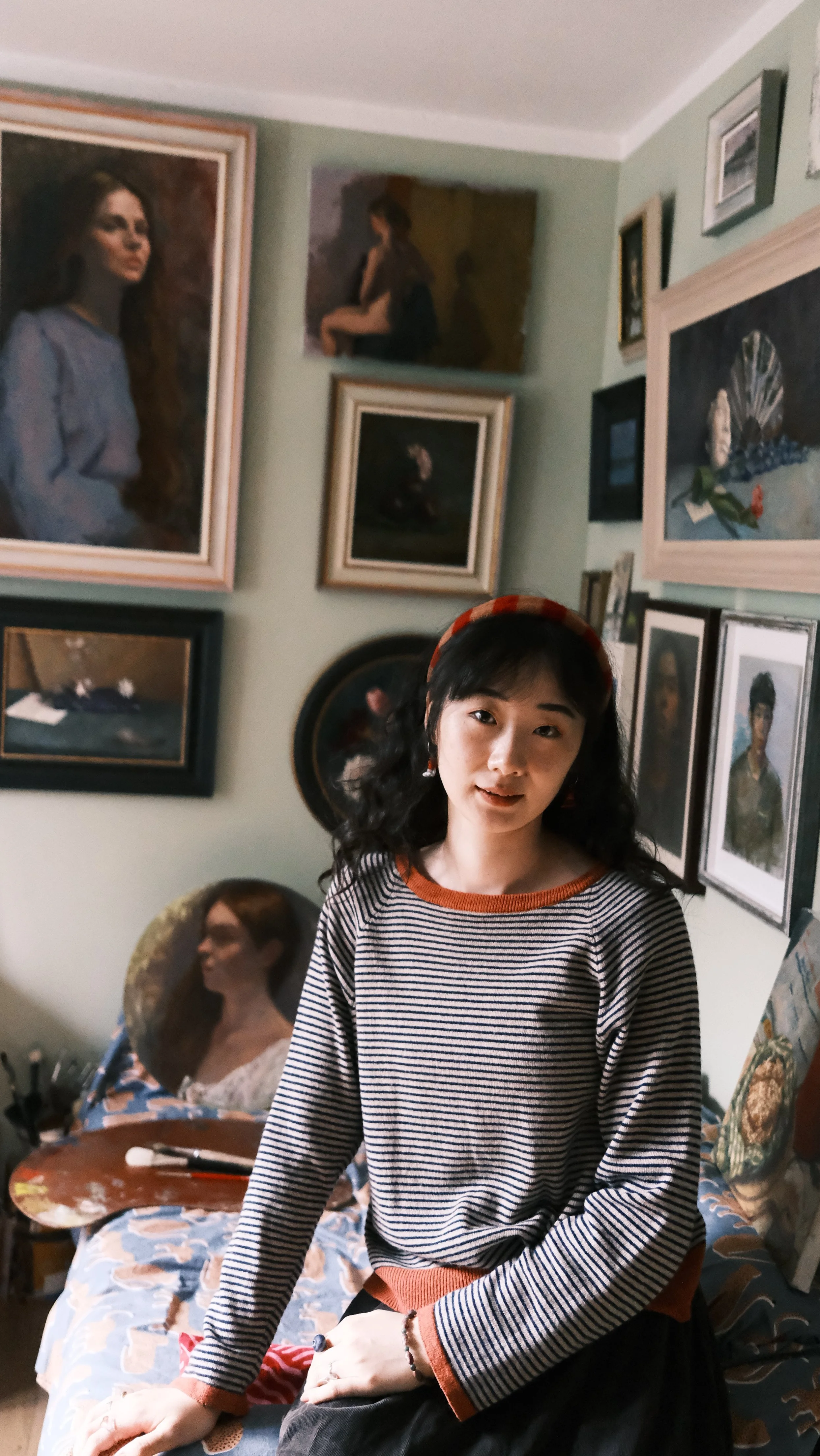
Shirley Chi in her London studio
What do you love most about working in pastel compared to other media?
I used to work with oils a lot, until I was introduced to pastel. I‘ve always hoped that my painting style could be much looser, bolder, and more vibrant. Pastels have greatly helped me achieve this. Unlike oil painting, where colours are mixed on the palette before being applied to the canvas, pastels allow me to mix colours directly on the paper, without considering too much about which is the right colour. Sometimes you can’t even get the exact colours of the objects, but the colour harmony, the intermittent lines, and the dots, created better results. I enjoy this process because it‘s not entirely controllable and often brings surprises.
Which surface or paper do you prefer working on?
I tried many different types of surfaces after I started working with pastels, beginning with ordinary drawing paper and later moving on to toothier pastel papers. I've used brands such as Fabriano Ingres, Sennelier, Canson, and Winsor & Newton. I think paper is a very personal choice, as it largely depends on the kind of results an artist wants to achieve.
Personally, I prefer rougher, more textured surfaces because they hold pastel dust better. As the pastel stick glides across the surface, the paper's texture naturally creates beautiful dry-brush-like marks, allowing the character of the paper to show through. When layering colours, the underlying hues remain visible through the gaps in the texture, creating a more vibrant effect.
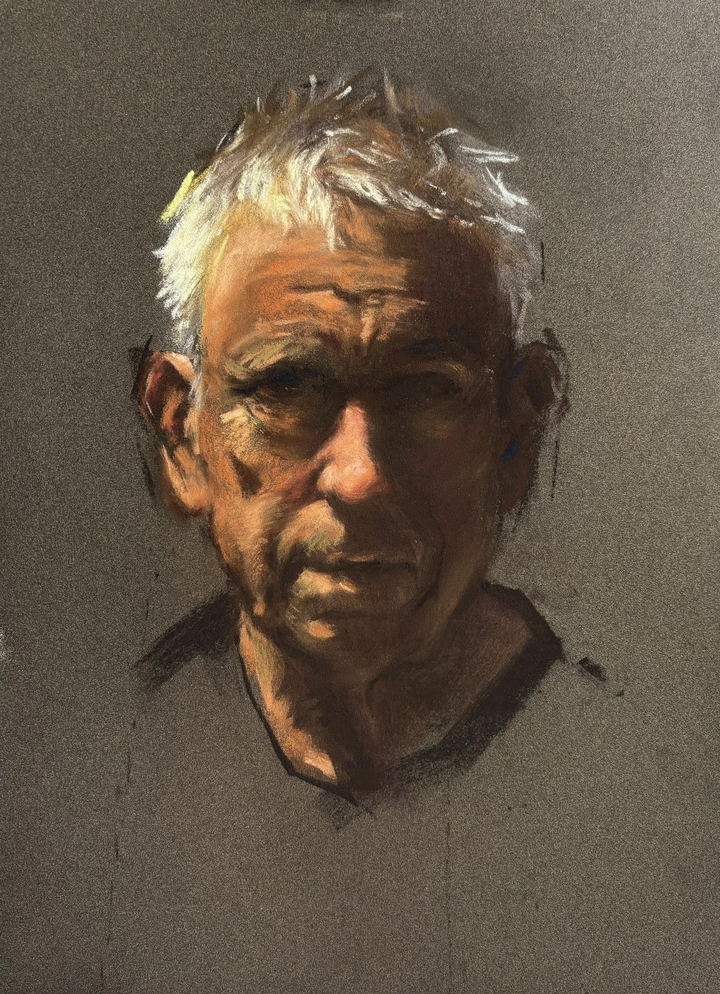
Head Study, Shirley Chi
Do you work from life, photographs, plein air or imagination?
When I create pastel portraits, I primarily work from life. I love capturing the colours of the surrounding environment, the emotions and impressions I receive from the sitter, the vivid colours brought about by constantly changing light, and all the other elements present in that particular moment. I enjoy the feelings that arise from these interactions.
Of course, it is not always possible to have someone available to pose. In those cases, high-quality photographs can also serve as valuable references and study materials. For practice. Most of the time, I use them as a starting point for my creative process, reinterpreting them through my own artistic sensibility rather than copying them literally, which I call ‘filtered’ creation.
What are your favourite colours to work with?
It depends on the subject. If I'm painting a portrait, blue is an essential colour to have. Basic colours such as brown, sienna, ochre, red, and a range of flesh tones are also very useful.
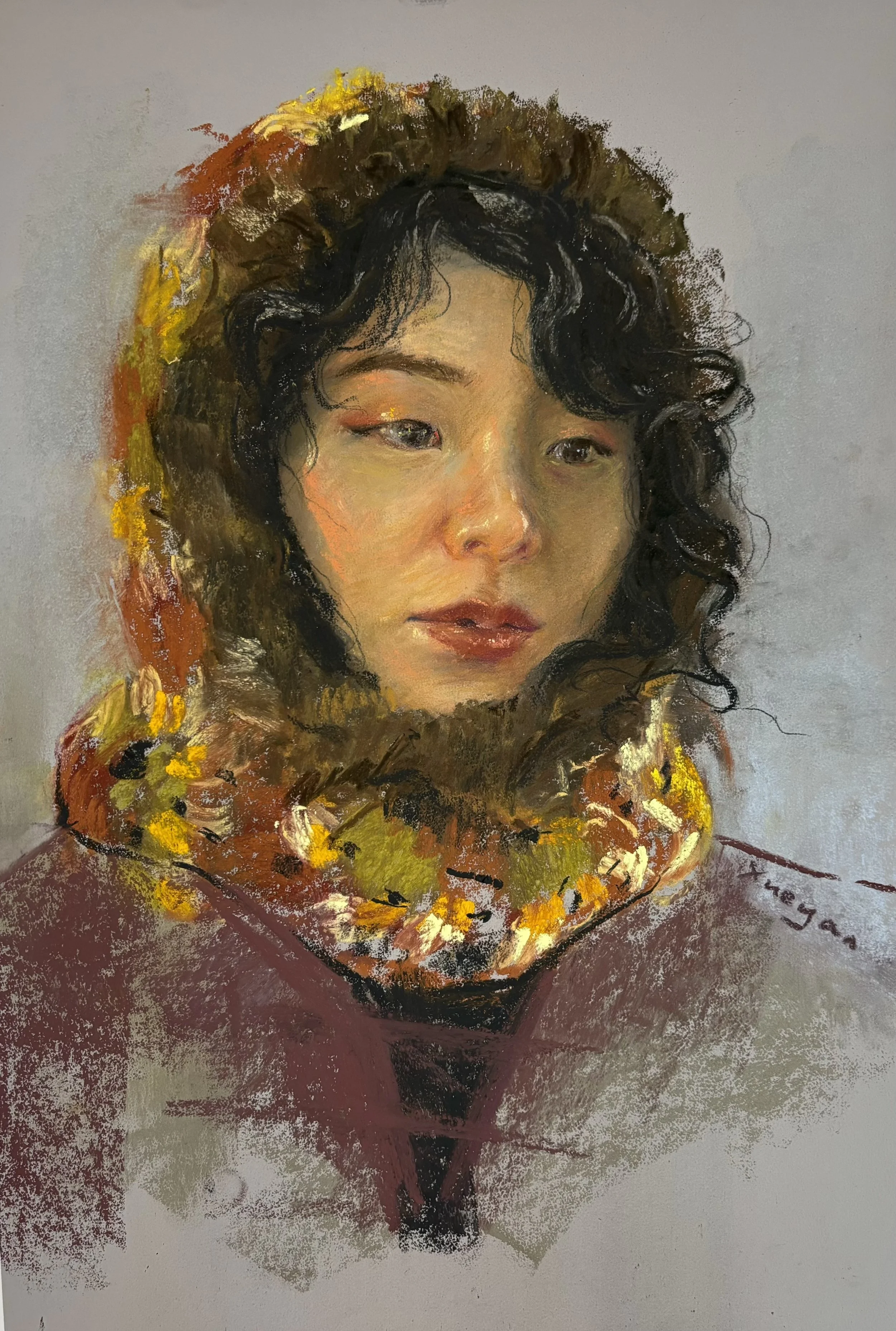
In My Hood, Shirley Chi
Do you use soft pastels, hard pastels, pastel pencils, or a mixture? What are your preferred brands? (preferably ones we sell at the shop!)
I like to combine soft pastels with pastel pencils, depending on the level of detail I want to achieve. Pastel pencils are particularly useful, as they can be used both for blending and for adding finer details. They help blend the layers while further enriching the colours.
I work with a range of pastel brands because, as any pastel artist knows, there is always another colour to add to the collection! At the moment, I primarily use Sennelier, Unison, Inscribe, and Bruynzeel.
How do you protect or frame finished pastel works?
I usually spray a few light coats of pastel fixative after finishing a pastel painting. However, soft pastel is a very fragile medium, and even after fixing, some pigment remains loose - particularly on heavily textured papers that hold multiple layers of pastel.
If the piece is intended for display, I recommend framing it behind glass. Otherwise, it’s better to safely store it in protective plastic sleeves or an art portfolio.
Shirley will be answering more questions about her practice and her advice for working with pastels in her workshop on 2 August.
If you are interested in seeing more of Shirley’s pastel works, please head to her Instagram to see more or click here for tickets to the workshop.