Pastel Spotlight: Anastasia Sokolov
London based artist Anastasia Sokolov took part in our Chelsea Paint Out 2026, where her pastel painting Under the Clouds, depicting Albert Bridge, caught the attention of our Managing Director, Hester Baldwin, earning a Highly Commended award. After discovering pastel painting as a child through local art classes in Germany, and after a decade-long career in UX, Anastasia turned to plein-air painting as a grounding practice during the pandemic. What began as a way to spend more time outdoors became a central part of her artistic journey and a catalyst for more intentional growth as an artist. Of her practice, she says she is easily moved by small things - a particular quality of light, the character of a tree branch. Her paintings often begin with moments that catch her attention and refuse to let go, and through painting from life and en plein air she seeks to preserve not only what a place or subject looked like, but her feeling of encountering it.
In 2025, Anastasia’s work was selected for exhibition with the Pastel Society at the Mall Galleries London, where she was awarded the Yoshimoto Prize. We spoke to Anastasia about her artistic practice, her love of pastels, and her advice for those looking to explore the medium. Read on to find out more.
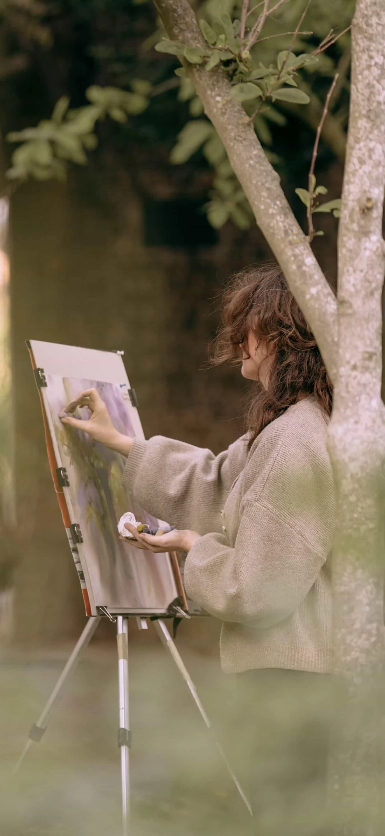
Anastasia painting en plein air
How did you begin working in pastel?
I first encountered pastels and Conté as practice mediums as a child at a local art club in Germany. They quickly became my medium of choice for still lifes and life drawing - much to my mother's disapproval, as she would have preferred something less smudgy. I then visited a Degas exhibition and saw light, movement and confidence captured with just a few pastel strokes. The marks seemed to breathe off the paper, and I fell in love with the medium all over again.
What do you love most about working in pastel compared to other media?
I fell in love with soft pastels as a child. They possess a unique ability to combine the graphic and the painterly. I love their tactile quality and the fact that they can be worked with directly by hand, as though I am feeling my way around the forms of a subject and infusing them with my own energy.
Their lightness and transparency also allow the paper itself to become a full participant in the painting. A few strokes can be enough to suggest a living form while preserving a sense of air, light and spontaneity.

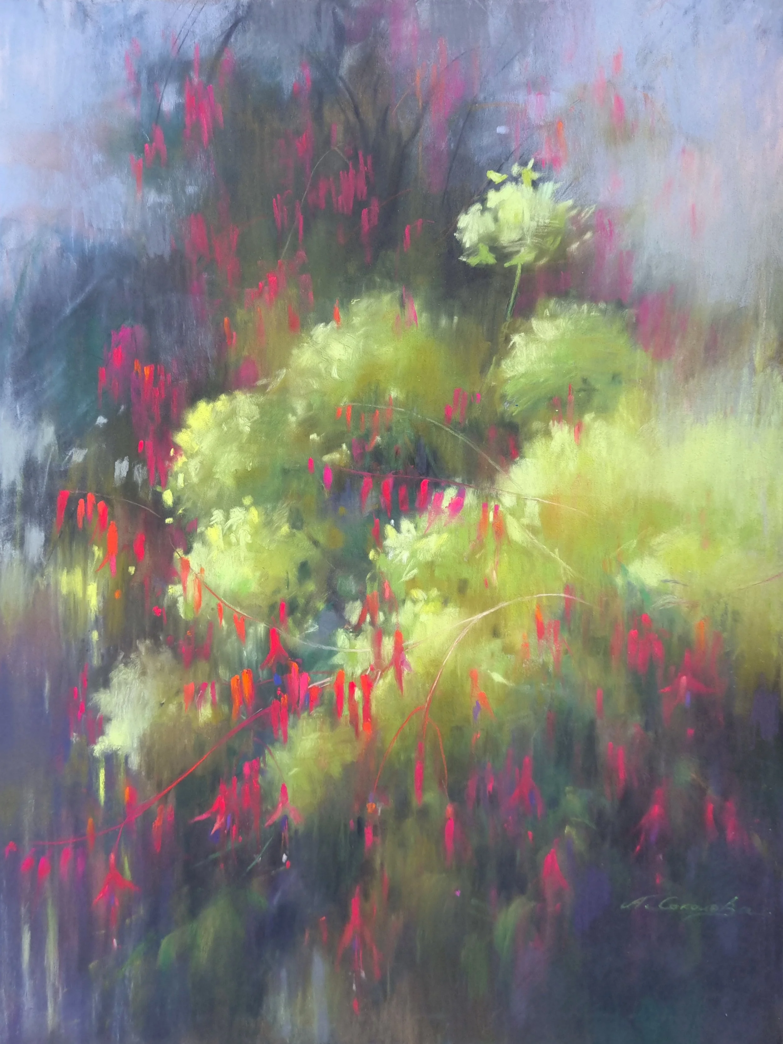
Under the Clouds, Pastel on paper, Anastasia Sokolov (highly commended from our Chelsea Paint Out)
What would you recommend for someone trying pastel for the first time?
Experiment! Try different surfaces: honeycombed pastel papers, abrasive surfaces of varying grit, watercolour paper prepared with gesso. Try different colours - bright, muted, warm and cold. Explore different shapes and types of pastel too - square and round sticks, softer and harder pastels, pastel pencils and combinations with charcoal. Don't be afraid to experiment with techniques and mixed media. Try working pastel over watercolour or acrylic, dissolving pastel with water or alcohol to create texture, or blending with fingers, cloths or paper towels. Most importantly, don't be afraid to leave visible marks. Many beginners become so captivated by pastel's ability to blend seamlessly that they forget to explore its equally exciting possibilities for mark-making and expressive brushwork-like strokes.

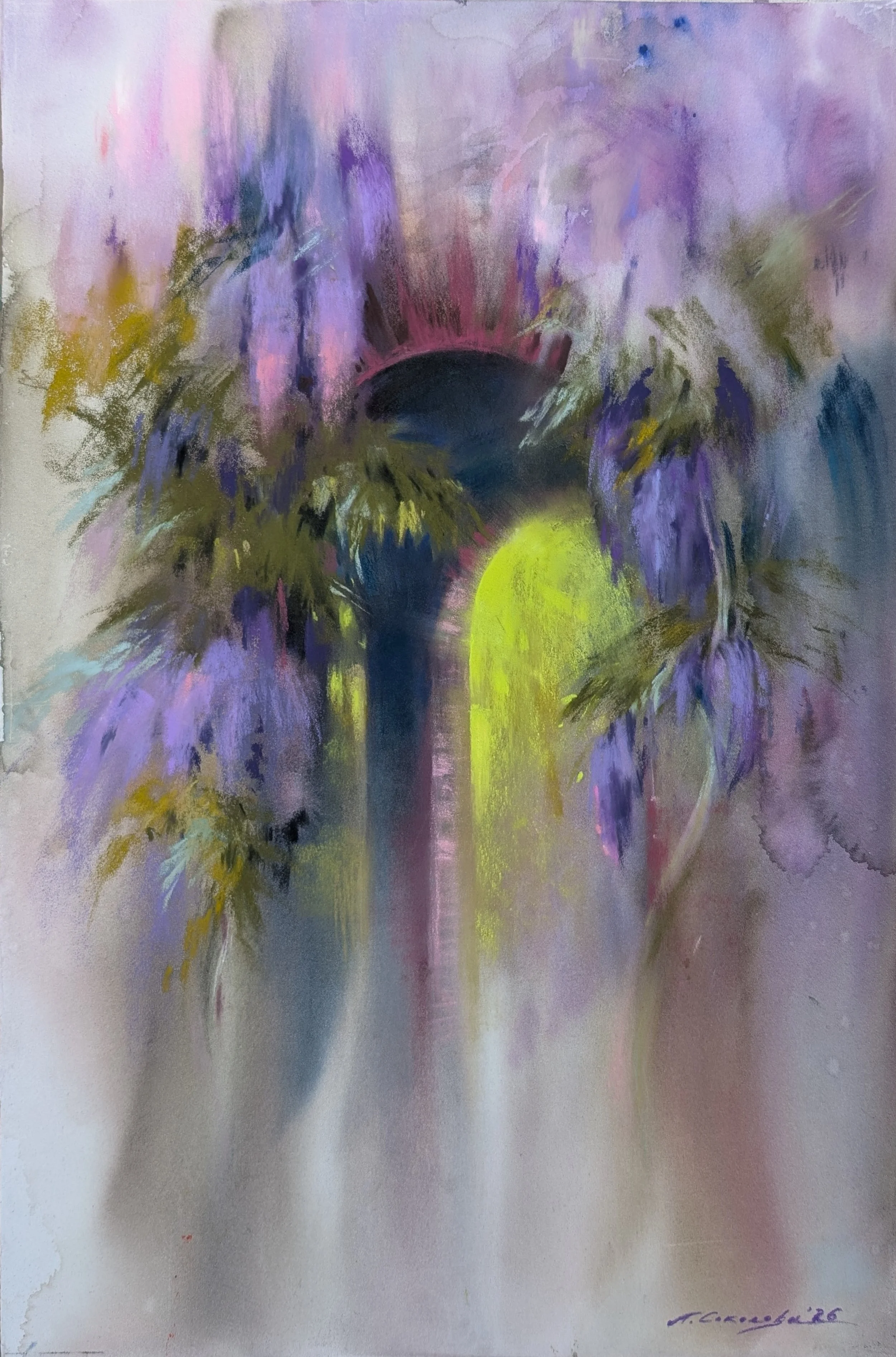
Her Habitat, Soft pastel and watercolour on paper, Anastasia Sokolov
How do you store your pastels?
Storage is probably my biggest challenge. I currently use an art supply cabinet with drawers, organised by colour and hue. At the same time, I am often tempted to organise my pastels by softness and size, as I use different grades of softness at different stages of a painting, and larger sticks tend to be more practical for larger formats. To make matters worse, I am constantly disrupting my own system by pulling out pastels for plein-air sessions. While some artists take large collections of pastels outdoors, I usually make a selection before leaving home based on the weather, location and subject I plan to paint. It helps reduce the weight I have to carry and makes painting more efficient by limiting my palette - and with it, the number of decisions I need to make. So far, I have yet to find the perfect storage solution... or perhaps discover that one simply doesn't exist.
Do you work from life, photographs, plein air or imagination?
I used to paint in a very different way. It involved collecting and combining numerous references and working late into the night in the studio. Lockdown changed that. I started going outside for fresh air and quick sketches, and quickly became hooked. Since then, working solely from photographs has begun to feel limiting, as though I am not using all of my senses. You can literally see the difference in the work. Large-format paintings can be challenging to complete entirely en plein air, so I often begin outside, absorbing as much of the atmosphere as possible before taking reference photos and continuing in the studio. The challenge is to hold on to that energy and immediacy. Recently, I have also started moving back towards more imaginative work and using references in a different way. But I suspect plein-air painting will always remain my greatest love.
Before the Summer Storm, soft pastel and charcoal on paper, Anastasis Sokolov
What are your favourite colours to work with?
At the moment, I seem to gravitate towards shades of purple, orange and olive green. It is not entirely a conscious choice - quite the opposite. I sometimes deliberately build a palette to avoid them, only to discover they have found their way back in anyway. Perhaps it is simply reflective of where I am right now, and that's okay. I do have other favourite colour combinations though: pink and sage, teal and magenta, and brown and blue.
How do you approach colour when working in pastel?
In my opinion, one of the main challenges of working with colour in pastel is that, while colours can be layered and optically mixed, you are ultimately limited by the values available in your box. When painting en plein air, I therefore tend to think ahead about both the subject and the lighting conditions. When selecting my palette, I try to ensure I have light, middle and dark values for each colour family I expect to need. The paper itself also plays an important role. I often treat it as an imprimatura, allowing it to remain visible in the middle tones and effectively "mixing" colours with the surface. One personal rule I try to follow is to paint slightly darker than I think necessary. It leaves room for the lightest accents at the end, allowing them to sing.
What is one pastel tool or material you couldn’t work without?
It is not actually a pastel tool, but paper towels! They lift and carry pastel remarkably well, making it easy to blend and smudge large areas with broad, painterly strokes. Another indispensable tool is a simple brush and some water. I use them to create texture, lift pastel layers and, occasionally, if it has all gone completely south, wash everything back and start again.

Leave a light on, soft pastel and watercolour on paper, Anastasia Sokolov
Do you use soft pastels, hard pastels, pastel pencils, or a mixture? What are your preferred brands?
I like working with pastels and charcoal of various hardnesses and shapes. Traditionally, pastel artists tend to work from hard to soft to avoid muddying colours. In my case that means starting with harder brands such as Faber-Castell and Rembrandt and leaving the buttery Unison and Sennelier pastels until the end.
I do that, but I also like to break the rules. Soft pastels spread beautifully, so I will sometimes start with them and use paper towels to block in large areas. If I am working over a watercolour underpainting, I often stop worrying about hardness altogether and simply choose the colours I need.
I also enjoy working harder pastels into softer layers, gradually hatching colour into the surface while building texture. Pastel pencils - mainly Derwent and Sennelier - are wonderful for branches, bark textures, highlights and portraits, although I probably don't use them nearly enough at the moment.
My secret little love is sauce crayons. They are an old drawing medium made from clay and minerals, with a soft, almost greasy quality and beautiful warm and cool greys. They are difficult to find in Western Europe, so I always try to bring some back when travelling east. For quick sketches in the park, I keep coming back to Conté sticks. They are relatively clean, wonderfully portable, and their square shape allows for both delicate lines and broad expressive strokes.
How do you protect or frame finished pastel works?
I buy large sheets of glassine paper and cut them to size when needed, wrapping the front of a pastel painting and securing the sheet at the back. Glassine is smooth, glossy, pH-neutral and acid-free, providing protection against friction, humidity and grease.
Personally, I never use fixatives. I don't fix layers as I work because I like to retain the option of lifting or reworking colour later on, and touching a finished painting feels like an unnecessary risk to me. Glassine provides all the protection I need while preserving the surface exactly as I intended it.
Who and What inspires you? Are there particular pastel artists that you admire?
I am constantly discovering new artists, revisiting old favourites, and rediscovering those I had somehow forgotten. There is always something to learn, regardless of medium, style or generation. Among pastel artists, a few names immediately come to mind. Olga Abramova's low-chroma paintings seep with light, and I admire her ability to make the often-overlooked space around a subject become the true protagonist of a painting.
Tony Allain is a master of reduction, creating vibrant illusions of reality through bold mark-making and fearless colour choices. I am also inspired by artists such as Anna Chepurnaya-Oleinik, Felicity House and Anastasia Krivenko, among many others. These artists have undoubtedly influenced my work, but perhaps more importantly, they continue to inspire me to keep exploring pastel itself - a beautiful medium that I believe remains chronically underrepresented in the contemporary art world.
Spring Passage, soft pastel and watercolour on paper, Anastasia Sokolov
Describe a typical day in the studio.
There is no such thing as a typical day in the studio for me. I work full-time and remotely from my bedroom, so setting up to paint is as much about creating the physical space as it is about creating the mental space for art. This is one of the reasons I love painting en plein air. It takes me out of my head, gives me a certain lightness, and surrounds me with impressions that I can translate onto paper. All I have to do is stay perceptive. At home, my thoughts are louder. It is harder to keep the energy going, and I risk getting bogged down in details. So I paint standing up and put on music that makes me move. My current playlist is a rather strange mix of salsa and Enya songs. I often stretch before I start and throughout the session as well. I work either on an easel or by pinning large sheets of paper to the wall. I cover the surfaces my pastels rest on, and sometimes even the carpet, with craft paper too - just in case. I am renting, after all. As a compromise, I often set up on our shared balcony or in the green space nearby. I may still be working from references, but I get to paint in daylight and breathe some fresh air.
To be honest, what helps me most is simply not putting my materials away. It can get messy, but setting up is the biggest hurdle for me, and whenever possible I prefer to skip it.
If you are interested in seeing more of Anastasia’s pastel works, please head to her Instagram or Website to see more!